St Ives (Hunts) Golf Club
ContentsClose
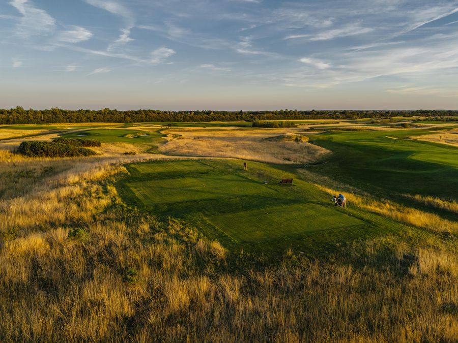
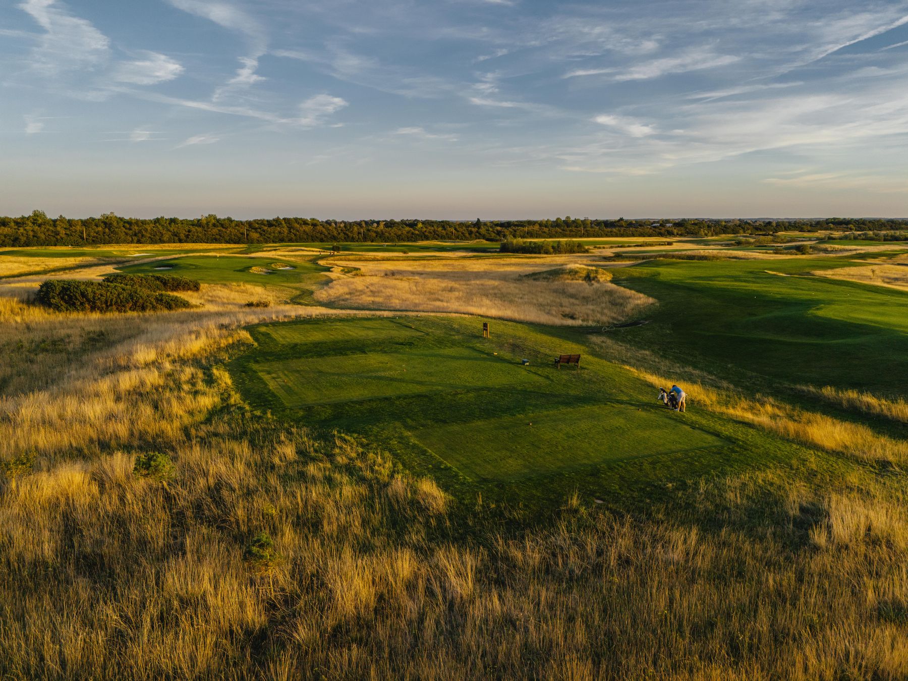
Golden-hour aerial of a tee cut into fescue, two golfers with a trolley waiting to play, the course running to a low tree line under a wide sky

St Ives (Hunts) Golf Club · Cambridgeshire · Founded 1923

Brand guidelines

Scroll to explore

Video placeholder · still photograph

The club is a hundred years old.

The course is fifteen.

Before you start

This is a reverse-engineered brand system. It was compiled by reading the live website, pulling the actual colour values and typefaces out of the site's stylesheet, and sampling the crest artwork pixel by pixel. Everything about colour, type and factual detail is measured and checkable today. Everything about voice, values and messaging is a proposal drawn from how the club already writes, and needs the club to say yes to it.

Measured Taken from the live site, its stylesheet or its artwork. Verifiable.

Proposed Synthesis. Requires club sign-off.

Nothing here has been approved by the club yet.

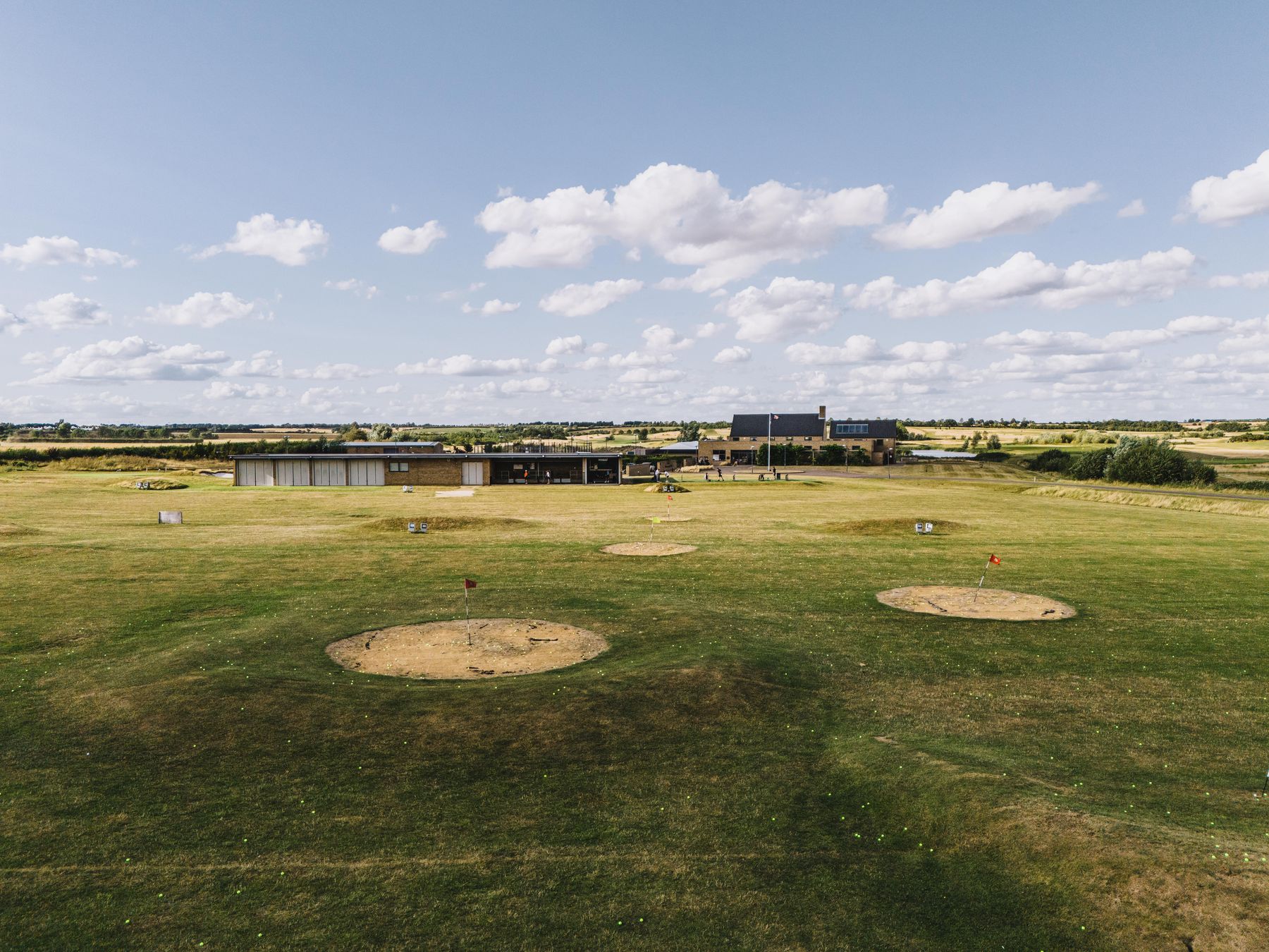
Aerial view over the practice ground to the range building and clubhouse, target greens cut into the grass, flat Fenland to the horizon under a cloud-scattered sky

The club

The club is a hundred years old. The course is fifteen. That sounds like a contradiction and it is actually the whole proposition.
The story in one paragraph Measured

St Ives (Hunts) Golf Club has existed since 1923. In 2007 it bought a 230-acre site at Giffords Farm off the Needingworth Road, commissioned the architect Cameron Sinclair, and in 2010 opened an inland links laid out on it. So you get a century of club, section and fixture life, played over a course built with modern drainage, USGA-specification greens and forty millimetres of sand capping. Neither half of that sentence works alone. Heritage on its own sounds like every other club in the county. A modern course on its own sounds like a resort. Together they are the only thing the club can say that nobody else can copy.

The numbers Measured

  • 1923Founded
  • 2010Course opened, Cameron Sinclair
  • 230Acres at Giffords Farm, bought 2007
  • 6,758Yards off the back, par 72
  • 40mmSand cap on every fairway
  • USGAGreens specification, velvet bent

Four tees on every hole: 6,758, 6,566, 6,147, and 5,626 yards. Paths between every tee and fairway.

What the club stands for Proposed

Decision 8

Mission

To give everyone, from a first-timer to a scratch golfer, a century-old club's welcome and a modern links course to test them on, in the middle of Cambridgeshire.

Vision

To be the club in the region that people recommend without hesitating, because it plays well in February, welcomes you properly in July, and never once makes you feel you are in the way.

Values, read out of what the club already does rather than a values statement it does not publish.

  1. 01

    Welcome before ceremony

    Visitors are welcome every day. That is a decision, and it should read as one.

  2. 02

    The course comes first

    Greens specification, drainage and sand-capping are led with, not buried in a footnote.

  3. 03

    Meet people where they are

    Four tees on every hole. Flexible memberships. Ten months at nought per cent. Juniors on reduced rates.

  4. 04

    Named people, not departments

    Every enquiry on the site goes to a person with a name. That is unusual, and it is a strength.

  5. 05

    A club, not just a course

    Sections, fixtures, socials, padel, and a clubhouse people actually sit in.

Brand personality Welcoming · Unstuffy · Well-run · Quietly proud · Practical

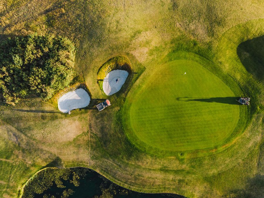
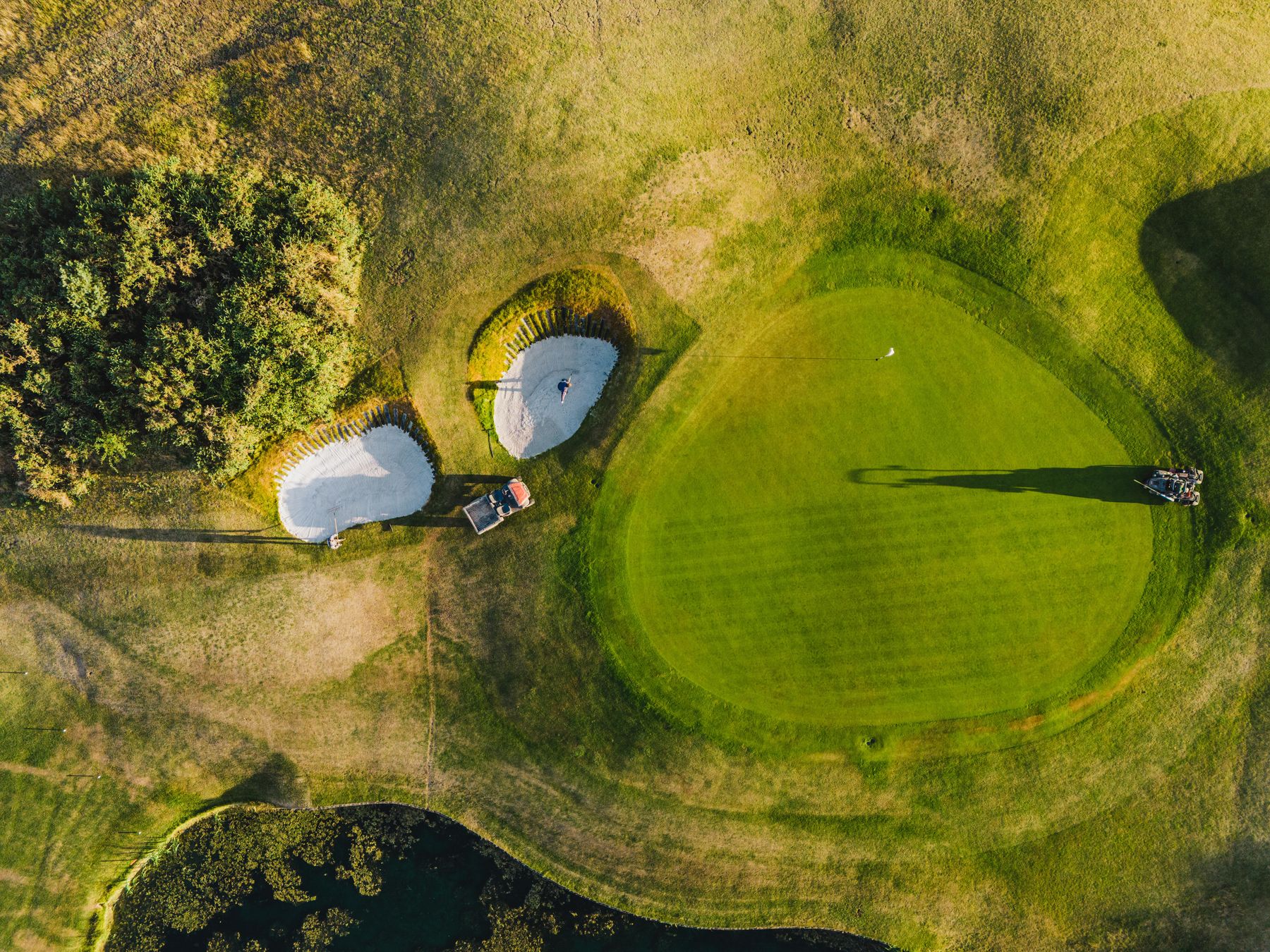
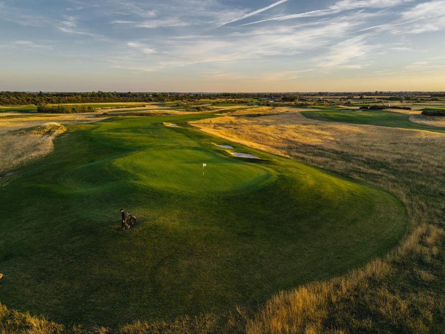
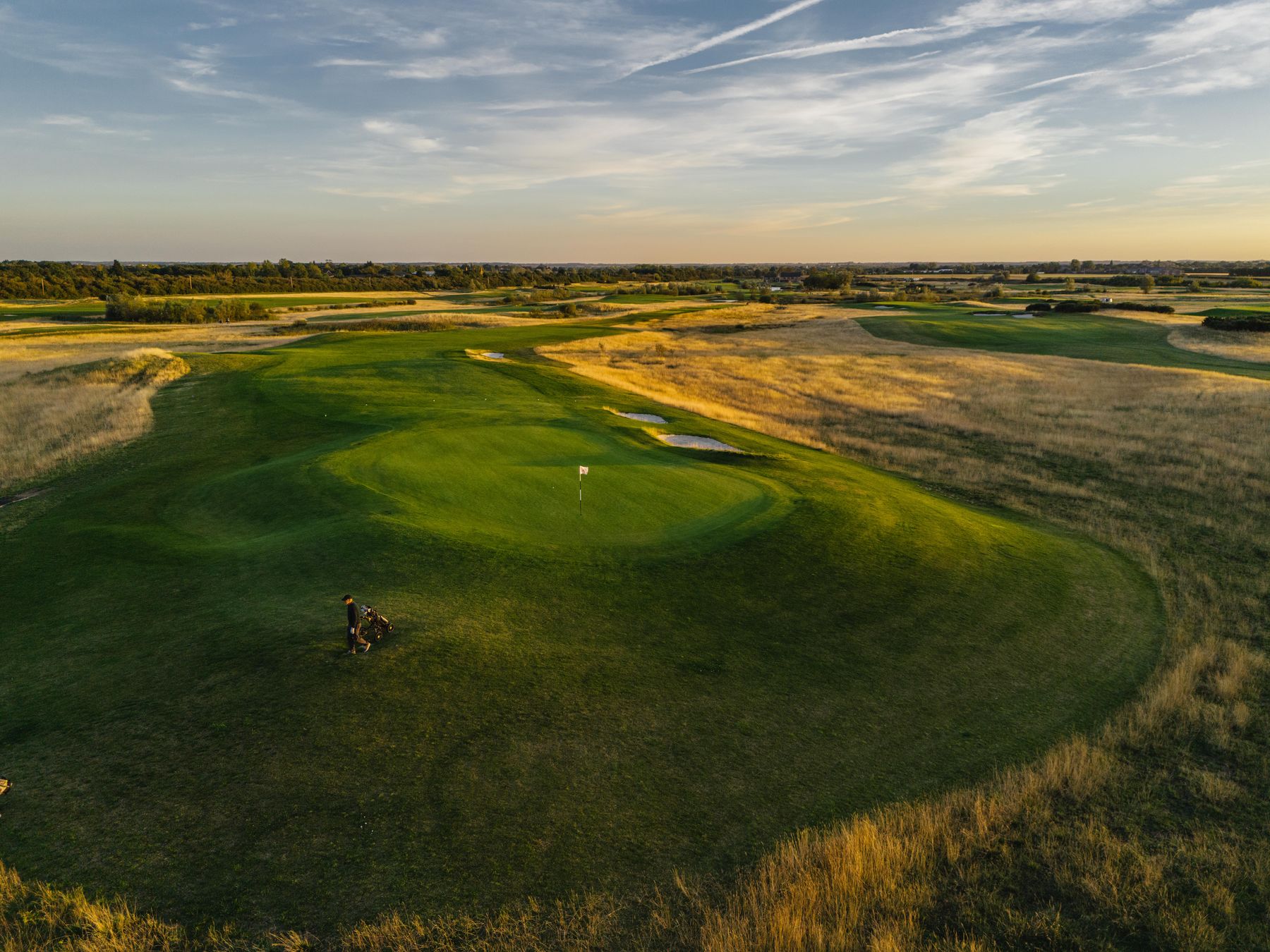
Golden-hour aerial of a green guarded by three revetted bunkers, a lone golfer pulling a trolley across the fairway, the rough turning gold

Positioning Proposed

For golfers in Cambridgeshire and Huntingdonshire who want a proper club without a waiting list, a joining fee or a members-only Saturday, St Ives (Hunts) Golf Club is a hundred-year-old club playing a modern inland links: sand-capped, fully drained and four tees a hole, so it is in condition and open to you when the clay parkland courses nearby are not.

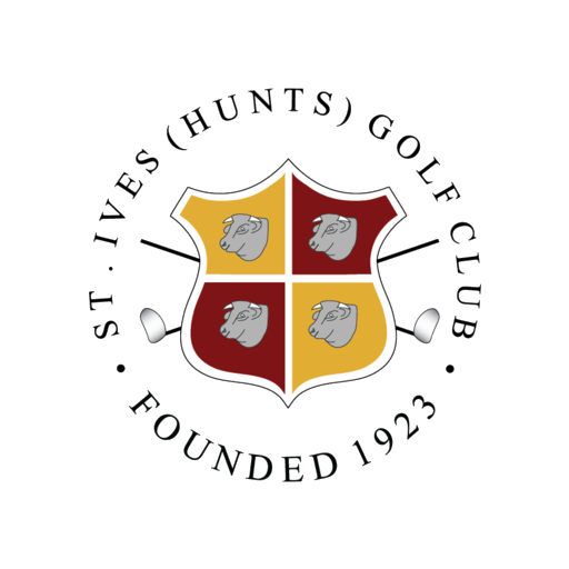
St Ives (Hunts) Golf Club crest: a quartered gold and red shield bearing four silver bulls' heads, crossed golf clubs behind, ringed by the club name and the words Founded 1923

The mark Measured

The lettering in the crest's surround is black, so the mark is unreadable placed directly on Club Navy. Until a reversed version exists, with the surround type in cream, the correct workaround on any dark ground is a light circular plate with clear space inside it, as used here. That is a stopgap, not the answer. The answer is item 2 in the table below.

How we look

A heraldic crest, navy and gold from the website, and photography that already knows what the Fens look like. The job is to make the three agree.

The crest Measured

Decision 1 and 2

The club's mark is a heraldic crest: a quartered shield in gold and deep red carrying four silver bulls' heads, two crossed golf clubs behind the shield, and the club name set in a circle around it.

Good news · the correct crest already exists

There are two different crests live on the club's own server right now. The website header serves a small one carrying a dated CENTENARY 2023 ribbon. The favicon folder serves a larger, cleaner one reading FOUNDED 1923, with no dated ribbon at all. The second one is the primary crest this document has been asking for, and it already exists. The fix is not a commission. It is changing which file the site points at.

The Founded 1923 crest, 512 pixels square, no dated ribbon

Use this one

Reads FOUNDED 1923. No dated ribbon. 512 × 512px, transparent. Currently served only as a favicon at /favicon/android-chrome-512x512.png.

Primary crest
The Centenary 2023 crest, 220 pixels wide, carrying a dated gold ribbon

Retire this one

Reads CENTENARY 2023. 220 × 227px. This is what the website header and every downstream asset currently uses. It is 2026.

Commemorative only

What exists, and what is still missing

MarkPurposeLargest fileStatus
Primary, full colourEverything. Web, print, signage, apparel512 × 512 PNGExists, unused
CommemorativeAnniversary years only220 × 227 PNGIn use by mistake
Vector master (SVG / EPS)Signage, flags, embroidery, large printnoneMissing
ReversedOn navy. Gold, silver and cream, no rednoneMissing
MonoSingle-colour navy, embroidery and etchingnoneMissing
Icon onlyShield alone, for avatars below 32pxnoneMissing
The blocker · there is still no vector artwork

512px is enough for the website and a social avatar. It is not enough for a sign, a flag, an embroidered shirt or anything printed larger than a business card. The crest needs redrawing as SVG and EPS before any print or signage work is commissioned. Until that exists, most of the print and signage work in this document cannot be executed.

Clear space and minimum size Proposed

Minimum clear space on all four sides equals the height of the lettering in the surround. Nothing sets inside that boundary: no type, no rule, no photograph edge, no second logo.

ContextMinimumNote
Full crest, print20mm wideVector artwork only
Full crest, screen80px wideBelow this the circular club name breaks up
Icon-only shield, screen32px wideUse instead of shrinking the full crest

Colour Measured

Decision 3

Colour: the conflict, first

The club is running three unreconciled sets of colours. The crest artwork, the website stylesheet, and the vestigial reds inside that stylesheet all disagree. Sampled directly from the artwork and counted directly from the CSS:

1 · The crest artwork says

#E2AD33Heraldic Gold
#7E1416Heraldic Red
#B3B3B3Heraldic Silver
#FFFFFFWhite

2 · The website says

#0D306F59 uses
#20609E29 uses
#A17B2C15 uses
#F4F1F0Warm Stone

3 · The orphaned reds

#8900064 uses
#A805323 uses
#7E1416the crest's own, for comparison

Three different reds and two different golds are in circulation. Nothing on the site resolves them, which is why the badge reads as borrowed rather than belonging.

Recommendation

Keep navy as the brand colour and gold as the accent, because that is what 59 and 15 declarations of live code already say, and because navy and gold is the more distinctive pairing in a category where almost everyone defaults to green. Then re-cast the red as a heritage colour with a narrow, defined job: it stays inside the crest, it takes the crest's own value #7E1416, and the orphaned #890006 and #A80532 are deleted from the stylesheet. It may appear on centenary, honours-board, club history and captain's material. It never becomes a general accent, and it never becomes a button. That gives one system with a reason, rather than three by accident.

Applied Proposed

Navy and gold, on the things the club actually prints

St Ives (Hunts) Golf Club

Founded 1923

Par 72 · 6,758 yards

Needingworth Road, St Ives, Cambridgeshire PE27 4AD · 01480 499920

Hole123456789Out
6,758
6,566
6,147
5,626
Par72
The scorecard. Hole yardages were not measured. The grid shows the layout: yardages for all four tees in one legible table, which is the piece most used and most often badly set.

St Ives (Hunts) Golf Club

Visitors welcome every day

Needingworth Road · PE27 4AD · 01480 499920

The sign at the gate. Navy ground, the crest on its plate, one line the club already says. Vector artwork is needed before this is made.

Colour usage rules

  • Navy is the default dark. Headers, footers, primary buttons, headings on light grounds.
  • Fairway Gold is a seasoning, not a ground. Never a large filled panel, where it turns mustard. If gold is ever a ground it is Pale Gold with navy type, and it is used once.
  • Light Gold and Pale Gold are for dark grounds only. They are too pale to read on white.
  • Heraldic Gold and Heraldic Red belong to the crest. Reproduce the crest in those values. Do not use them to paint anything else.
  • Warm Stone breaks up long pages. Alternate white and Warm Stone. Never introduce a third background tint.

The palette Measured

Every value, counted

Primary

Club Navy

#0D306F
13, 48, 111
88 / 57 / 0 / 56

59 uses. Headers, headings, primary buttons, footer.

Fairway Gold

#A17B2C
161, 123, 44
0 / 24 / 73 / 37

15 uses. Rules, hovers, small flourishes. Never body text.

Secondary

Sky Blue

#20609E
32, 96, 158
80 / 39 / 0 / 38

29 uses. Links and hover states. If it is blue and not navy, it should be clickable.

Light Gold

#D9B764
217, 183, 100
0 / 16 / 54 / 15

6 uses. Dark grounds only.

Pale Gold

#E6C679
230, 198, 121
0 / 14 / 47 / 10

4 uses. Highlights and rules on navy.

Heraldic, crest artwork only, sampled from the PNG

Heraldic Gold

#E2AD33
226, 173, 51
0 / 23 / 77 / 11

The shield gold. Reproduce the crest with this, not Fairway Gold.

Heraldic Red

#7E1416
126, 20, 22
0 / 84 / 83 / 51

The shield red. Heritage material only. Replaces #890006 and #A80532.

Heraldic Silver

#B3B3B3
179, 179, 179

The bulls' heads and the crossed clubs.

Neutrals

White

#FFFFFF
255, 255, 255

134 uses. Default page ground.

Warm Stone

#F4F1F0
244, 241, 240

6 uses. Alternating section grounds.

Body Grey

#4B4B4B
75, 75, 75

11 uses. Body copy.

Ink

#222222
34, 34, 34

7 uses. Maximum-contrast text.

Rule Grey

#E4E4E4
228, 228, 228

4 uses. Borders and dividers.

Accessibility Measured

Contrast, measured not asserted

Contrast ratios calculated to WCAG 2.1 from the measured hex values. Body text needs 4.5:1; large text, meaning 24px or 18.66px bold and above, needs 3:1. Each row below is rendered in the actual colours.

Club Navy on white12.58:1Pass
Body Grey on white8.72:1Pass
Sky Blue on white6.50:1Pass
Heraldic Red on white10.51:1Pass
Fairway Gold on white3.90:1Body fail
Heraldic Gold on white2.05:1Both fail
White on Club Navy12.58:1Pass
Pale Gold on Club Navy7.62:1Pass
Light Gold on Club Navy6.53:1Pass
Fairway Gold on Club Navy3.23:1Body fail
The two hard rules this produces

Fairway Gold #A17B2C fails for body text on both white and navy. It is a rule, border, icon and large-heading colour. Never paragraph text, never small print, never a caption, never link text at body size.

Heraldic Gold #E2AD33 fails as text entirely, at 2.05:1 on white. It exists to fill the shield in the crest. It is never used to set type on a light ground.

Display type Proposed the recommended tagline, decision 4

Libre Caslon Display, standing in for a display serif the club has not yet chosen.

Typography Measured

Decision 5

The site loads Proxima Nova from Adobe Typekit, kit pdh2nxp, in weights 300, 400, 500, 600 and 700 plus one italic. The stylesheet declares font-family: proxima-nova, Arial, Helvetica, sans-serif.

Proxima Nova is a licensed Adobe font, so anyone producing print work needs their own Adobe Fonts licence for it. Do not substitute Montserrat. It is the common free lookalike and it is noticeably wider and rounder; set side by side the difference is obvious.

The typographic gap, and this page as the argument

The club sets one typeface for everything. That is clean, and it is also why the site reads as competent rather than characterful. A century-old club with a heraldic crest has an obvious opportunity: introduce a serif for display use only, meaning the homepage headline, section openers, the wedding brochure, menus, honours boards and certificates, and keep the sans for every piece of interface and body copy. This page is set that way so the club can judge the effect. Display type here is Libre Caslon, an English transitional face in the tradition the crest already borrows from. Body copy here is Proxima Nova, loaded from the club's own Typekit kit pdh2nxp. That kit is licensed to the club's domains; any other site using this system needs its own Adobe Fonts licence.

AaDisplay, serif
AaEverything else, Proxima Nova

Display · Libre Caslon Display 400 · 56 to 72px · line-height 1.1

The links in the Fens

H1 · Libre Caslon Text 700 · 40 to 48px

Visitors are welcome every day

Body · Proxima Nova 400 · 17px · line-height 1.6

Fairways sand-capped with forty millimetres of sand, fully drained and irrigated, with pathways between every tee and fairway. It means the course is in condition and open to you in February as well as July.

Label · Proxima Nova 600 · 13px · letter-spacing 0.06em

Book a tee time

Hierarchy Proposed

LevelFaceWeightSizeLine heightUse
DisplayLibre Caslon40056 to 72px1.1Hero, brochure covers
H1Libre Caslon70040 to 48px1.15Page titles
H2Libre Caslon70030 to 34px1.2Section headings
H3Libre Caslon70022 to 24px1.3Sub-headings
BodyProxima Nova40017px1.6Paragraphs
Body largeProxima Nova30020px1.6Standfirsts
CaptionProxima Nova40014px1.4Photo captions
LabelProxima Nova60013px1.2Buttons, tags. Uppercase, 0.06em

Typographic rules

  • Line length 60 to 75 characters. Body copy sits in a column, not edge to edge.
  • Sentence case for headings. Not Title Case, not ALL CAPS except on small labels and buttons.
  • Never centre a paragraph. Centre a heading if you like. Never a block of running text.
  • Never justify. It creates rivers at this line length.

Photography Measured

Decision 6

The club's photography is genuinely good and it already has a consistent look. Keep all of it. It is the strongest part of the current brand. A second bank of ten frames arrived on 4 September 2026, golden hour on the ground and from the air, and this page is now built from it. These are the club's own originals, at full resolution.

Measured Two frames in the September bank show the range building carrying a Titleist wordmark, one of them the only close shot of a golfer. Both are excluded from the brand set under the club's own rule below: no competing logo in frame. Two padel-court aerials are in the bank and not on this page; they belong to the facilities pages, not the identity.

  • Golden hour. Low, warm, raking light. Long shadows. Sun in frame or just out of it.
  • Big Fenland skies. The horizon sits low, sky takes half the frame or more.
  • Foreground framing with grasses and reeds, shot shallow, leading the eye to water and green.
  • Blues and straw-golds dominate, which happens to echo the navy and gold palette.
The gap · people are still small and seen from above

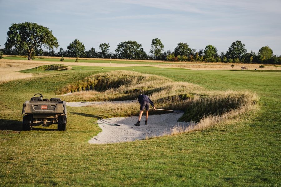
The copy's entire argument is welcome, warmth, staff, sections and community. The September bank puts people in frame for the first time, a greenkeeper raking a bunker, two golfers on a tee, but every one of them is small, from behind, or from the air. Nobody is close enough to be welcomed by. Commission a second bank to sit alongside them: four-balls on the tee, the bar in use at five o'clock on a Saturday, juniors being coached, the ladies' section at a fixture, a wedding party outside the clubhouse, staff behind the bar. Same golden-hour treatment and warm grade, so the two banks read as one set. Working ratio: 60 per cent landscape, 40 per cent people.

What to avoid

  • Stock photography of golfers who are obviously not at this course
  • Anyone in frame breaking the club's own dress code
  • Grey, flat, overcast light. If the weather is poor, do not shoot
  • Over-sharpened, HDR-crunched landscapes with haloed tree lines
  • Photographs of empty rooms on the weddings and functions pages. An empty function room sells nothing
  • A competing logo in frame. Equipment brands on range buildings, bag tags or flags are cropped out or the frame is not used

In use Proposed

The brand on the things the club sends

Visitors are welcome every day

Book a tee time
Ring us

Website

  • Header: white ground, the Founded 1923 crest at 80px minimum, navy navigation type at 15px weight 600.
  • Hero: full-bleed golden-hour photograph, navy overlay at 30 to 40 per cent so white headline type clears 4.5:1.
  • Primary button: Club Navy fill, white label, 8px radius, 16px by 32px padding. Hover to Sky Blue.
  • Secondary button: transparent fill, 2px navy border, navy label. Hover to navy fill.
  • Links in body copy: Sky Blue, underlined. Never gold.
  • Section rhythm: alternate white and Warm Stone, 80px vertical padding on desktop and 40px on mobile, which is what the current stylesheet already does.
  • Every page ends with a way to act: book a tee time, request a brochure, or ring the club.

Thomas Munt

General Manager

01480 499920 · stivesgolfclub.co.uk

St Ives (Hunts) Golf Club
Needingworth Road, St Ives, Cambridgeshire PE27 4AD

The reverse would carry the reversed crest, which does not exist yet, so the roundel stands in.

Business cards

85 × 55mm. Crest, name and role on the front, navy on white. Reverse in solid Club Navy with the crest reversed and the address in cream. Uncoated stock, 350gsm minimum.

25mm 60mm · body copy starts here
9pt

St Ives (Hunts) Golf Club · Needingworth Road, St Ives, Cambridgeshire PE27 4AD · 01480 499920 · stivesgolfclub.co.uk

Letterhead

Crest top-left at 25mm, address block at the foot in 9pt Body Grey, a 1px Fairway Gold rule across the bottom. Body copy starts 60mm from the top.

A hundred-year-old club. A course built to play all year.

St Ives (Hunts) Golf Club

Presentations

16:9. Navy title slides with the crest reversed, white content slides. Titles 30pt in Libre Caslon Text 700, body 18pt Proxima Nova minimum and never below 16pt. No more than 30 words to a slide.

Menu cover

Warm Stone stock, the crest centred, the display serif for the title and the sans for everything under it. No dishes are shown because none were measured.

Thomas Munt

General Manager

St Ives (Hunts) Golf Club
Needingworth Road, St Ives, Cambridgeshire PE27 4AD
01480 499920 · stivesgolfclub.co.uk

Email

Crest on white, centred, 120px wide. No photograph in the header. Body set in Arial, since Proxima Nova will not render in most email clients: 16px, #4B4B4B, left aligned, single column, 600px wide.

Name in navy weight 600, role in Body Grey, the rest in Body Grey at 14px, crest at 60px above the name. No quotations, no legal boilerplate longer than the signature, and no green "think before you print" line.

Social media

  • Avatar: icon-only shield on white. The full crest is unreadable in a circle.
  • Post mix: roughly a third course condition and photography, a third club life meaning results, sections, juniors and socials, and a third offers, opens, and visitor and society availability.
  • Hashtags: a maximum of three, and they should be real. #StIvesGolfClub #InlandLinks #CambridgeshireGolf.
  • Never post a grey-sky photograph. Hold it until the light is right.

Print

ItemSpecification
ScorecardsNavy and white. The Founded 1923 crest on the cover. Yardages for all four tees in one legible table. This is the piece most used and most often badly set.
SignageVector artwork only, which does not yet exist. Primary crest. Navy ground with the crest reversed reads best from a distance and at dusk.

Brand don'ts, the one-page checklist

  • Never use the CENTENARY 2023 crest. The Founded 1923 crest already exists, use that
  • Never enlarge a raster crest for print. Commission vector artwork first
  • Never set Fairway Gold #A17B2C as body text. It fails contrast on white and on navy
  • Never set Heraldic Gold #E2AD33 as text at all. It is a shield fill, at 2.05:1 on white
  • Never use a colour outside the palette above
  • Never substitute Montserrat, or any other lookalike, for Proxima Nova
  • Never use Title Case or ALL CAPS for headings, except on small labels and buttons
  • Never write stunning, fantastic, first class, boasts or nestled
  • Never use an em-dash, and never more than one exclamation mark in a social post
  • Never publish a grey-sky or flat-light photograph
  • Never show an empty room on the weddings and functions pages
  • Never route an enquiry to a department when it can go to a person by name

How we speak

The club sounds like a good general manager showing you round: warm, straight, quietly proud of the place, and never once making you feel you should have known something already.

Proposed The voice essence.

Tone dimensions Proposed

DimensionWhere it sits
Formal to casualSlightly casual. Contractions are fine. Slang is not.
Serious to playfulMostly serious, with room for dry warmth. Never jokey.
Reserved to enthusiasticWarm, and evidenced. Enthusiasm is earned with a fact, not asserted with an adjective.
Ornate to plainPlain, always.

The voice, in seven lines Proposed

Nothing here is an adjective. Two of the lines are taglines the club has not yet chosen (decision 4). The rest are things that are true on a Tuesday in February.

A hundred years old.

Fifteen years young.

The links in the Fens.

Welcome every day.

Four tees on every hole.

Sand-capped, forty millimetres deep.

Ring us on 01480 499920.

Voice qualities Proposed

Five ways to tell it is us

1. Welcoming, not ingratiating

Do

Visitors are welcome every day. Book online, or ring us on 01480 499920.

Don't

We would be simply delighted to have the pleasure of welcoming you.

2. Specific, not superlative

Do

Sand-capped fairways, forty millimetres deep, so the course drains and stays open.

Don't

Our stunning course boasts fantastic, first-class facilities.

3. Plain, not corporate

Do

Every hole has four tees, so you can play it at a length that suits you.

Don't

We offer a multi-tee solution catering to golfers across the ability spectrum.

4. Confident, not boastful

Do

One of the first courses in the country built to USGA greens specification.

Don't

The undisputed finest golfing experience in Cambridgeshire.

5. Human, not institutional

Do

Ring James Hart, our Golf Operations Manager, on 01480 499920, option 1.

Don't

Please contact the Golf Operations Department for further information.

Vocabulary Measured the four live words Proposed the lists

stunningfantasticfirst classboasts

These four are live on the club's own pages today. They are what the site reaches for when it has run out of facts, and this club has more facts than almost any comparable course. Replace each one with the thing that made you want to use it.

We say

inland linkssand-cappedwelcomevisitorsmembersthe cluba proper testin conditionfour teesflexibleyour roundthe clubhousesectionsfixturesour teamring usa hundred years

We don't say

stunning livefantastic livefirst class liveboasts livestate-of-the-artpremierluxuriousexclusiveunrivalledbespokenestleda hidden gemworld-classprestigiouselevateexperiencereach out

Writing style Proposed

House rules

  1. British English throughout. Colour, organise, enquiry, programme, centre.
  2. Oxford comma. Always.
  3. Sentence length. Vary it. Average around 15 to 20 words. A short one lands.
  4. Sentence case for all headings. Not Title Case.
  5. No exclamation marks in club-published copy. One per social post at the absolute most.
  6. No em-dashes. Use a comma, a full stop, or a colon.
  7. Numbers. Spell out one to nine, numerals from 10. Always numerals for yardages, pars, handicaps, prices, dates and times: 6,758 yards, par 72, £45, 8.30am.
  8. Dates. 3 September 2026, not 3rd Sept.
  9. The club's name. St Ives (Hunts) Golf Club in full on first mention and in every formal document. St Ives Golf Club thereafter in running copy. The club after that. Never "SIGC" outward-facing. No apostrophe in St Ives.

Messaging Proposed

Decision 4

A hundred-year-old club. A course built to play all year.

Proposed The core message.

Value proposition

St Ives (Hunts) Golf Club has been a club since 1923 and has played this course since 2010. Cameron Sinclair laid out an inland links across 230 acres of Cambridgeshire: USGA-specification greens, fairways sand-capped and fully drained, four tees on every hole, and paths between all of them. It means the course is in condition and open to you in February as well as July, and that whoever you bring, there is a set of tees that fits. Visitors are welcome every day.

Tagline routes

RouteLineLeans on
Heritage and modernityA century of welcome. A course built for now.The 1923 / 2010 story
The courseThe links in the Fens.The single hardest thing to copy
The welcomeWelcome every day.The club's own most repeated idea
Recommendation

Pick one and hold it for at least three years. The links in the Fens is the recommendation: short, geographically true, memorable, and no competitor within an hour can say it.

Key messages, with proof

MessageProof
It plays when others don't.Fairways sand-capped with 40mm of sand, fully drained and irrigated. Pathways between every tee and fairway, so trolleys and buggies run near year-round.
It is a real test, at your length.6,758 yards off the back to par 72, with tees at 6,566, 6,147 and 5,626. Four tees on every hole.
The greens are the good bit.USGA specification, velvet bent grass. One of the first courses in the country built this way.
You don't have to join to play.Visitors welcome every day, booked online with instant confirmation.
And joining is not a cliff edge.Flexible categories, pay-as-you-play, reduced rates for juniors and distant members, and membership spread over ten months at 0% interest.
There is a club here, not just a course.Men's, ladies', juniors' and mixed sections, competitions, county and regional fixtures, socials, padel, and a clubhouse with a bar and kitchen.

Audience angles

AudienceLead withDo not lead with
Prospective membersFlexibility and the sections. You can join in a way that fits your life, and there are people to play with when you do.Yardage
Visiting golfersCondition and access. It is in condition, you can book online, you are welcome today.Club history
SocietiesTailoring and a named person. Every day is different, James will build yours.The clubhouse menu
Weddings and functionsThe view, the licence and the people. Ceremony and reception in one place, with Chelsea running it and Martyn cooking it.Golf
PadelSociable, quick to learn, and it is here now.Technical rules

Contacts and assets

Brand guardian: Thomas Munt, General Manager. All brand decisions, all approvals, and any exception to this document.

  • General management and membershipThomas Munt, General Manager01480 499920, option 1
  • Golf operations and societiesJames Hart, Golf Operations Manager01480 499920, option 1
  • Weddings, functions and eventsChelsea, Events Manager01480 499920
  • CateringMartyn, Head Chefvia the clubhouse

Club details for all published material

St Ives (Hunts) Golf Club
Needingworth Road, St Ives, Cambridgeshire PE27 4AD
01480 499920 · stivesgolfclub.co.uk
facebook.com/StIvesHuntsGolfClub · twitter.com/stiveshuntsgc

Asset location · to be established

There is currently no central store of brand assets. The correct crest is hiding in a favicon folder, the wrong one is in the theme's logo folder, and there is no vector master anywhere. Setting up a single shared folder holding vector artwork, the approved photography library and this document should be the first action taken from these guidelines.

Open decisions

Eight things only the club can settle

These cannot be settled without the club, and each one blocks something downstream.

  1. 1

    Switch the site to the Founded 1923 crest

    The correct crest already exists on the club's own server. Every printed item currently celebrates an anniversary that ended in 2023. This is a file swap, not a commission.

    GM
  2. 2

    Commission vector artwork, SVG and EPS

    No signage, apparel or large print can be produced properly until this exists.

    GM
  3. 3

    Settle navy and gold as the palette, heraldic red as heritage only

    Three reds and two golds are in circulation at once.

    Committee
  4. 4

    Choose one tagline and hold it

    Recommendation: The links in the Fens.

    Committee
  5. 5

    Approve or reject the display serif

    The cheapest single change to make the brand look like the club it is.

    GM
  6. 6

    Commission people photography

    The September bank puts golfers and a greenkeeper in frame, small and from the air. Nothing yet shows a face, the bar, or a section at a fixture, while all the copy is about welcome.

    GM
  7. 7

    Decide whether to publish prices

    Green fees, society packages and wedding packages are all unpriced on the site, which loses the enquiries that will not ring.

    Committee
  8. 8

    Confirm the mission, values and voice

    They are inferred from the club's own writing, not supplied by the club.

    Committee