A crest full of yellow, red, blue and green. A website built from charcoal and two grey-blues. They do not share a single colour.
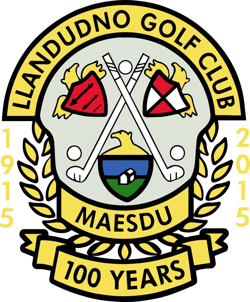
The club's mark is a full heraldic achievement, and it is busy. A gold arch across the top is lettered LLANDUDNO GOLF CLUB. Below it, two shields flank a pair of crossed golf clubs and a ball: the left is red with three arrows in bend, the right is white with a red saltire, each set in gold mantling. A central shield carries a gold chief with a bird's head above it, a blue band, and a green base bearing a white building. A gold laurel wreath runs down both sides. A banner reads MAESDU. Beneath it, a second ribbon reads 100 YEARS, with 1915 and 2015 either side. Proposed The two flanking shields are almost certainly borrowed civic or family arms, but their identification is not established here and should be confirmed by the club before anyone describes them in print.
Problem · the club's only mark is a centenary badge, and the centenary was eleven years ago
The mark in the website header, and the mark served as the phone icon, are the same file, and it reads 1915, 2015 and 100 YEARS. That was a commemorative mark for the club's centenary year. It is now 2026. Every printed item, every shirt and every sign made from this artwork celebrates an anniversary that finished eleven years ago. The favicon folder was checked, because that is where an undated version is often hiding. There is no undated version. There is no reversed version, no single-colour version and no simplified icon.
Good news · the artwork is already vector, which almost never happens
The header logo is not an image file. It is an SVG symbol inside the theme's icon sprite, drawn with 114 paths on a 252.99 by 304.85 viewbox, with the colours set inline on the paths. That means the club already owns clean, scalable master artwork, and it can be enlarged to any size for a sign, a flag or embroidery. Most clubs have nothing of the kind. It also means removing the centenary elements is an edit to a file the club already has, not a commission for new artwork. A designer opens it, deletes the lower ribbon and the two dates, and closes the gold wreath. That is the whole job.
What is in use today
Carries 1915, 2015 and 100 YEARS. Served as symbols.svg#logo in the site header and as apple-touch-icon.png. It is the club's only mark.
Commemorative, and dated
What exists, and what is still missing
| Mark | Purpose | Largest file | Status |
|---|
| Primary, undated | Everything. Web, print, signage, apparel | none | Missing |
| Commemorative | Anniversary years only | SVG, 114 paths | In use as the primary |
| Vector master (SVG) | Signage, flags, embroidery, large print | 252.99 × 304.85 | Exists |
| Reversed | For dark grounds, where the black keyline is lost | none | Missing |
| Mono | Single colour, embroidery and etching | none | Missing |
| Icon only | A simplified device for avatars below 32px | none | Missing |
The blocker · detail, at the sizes the mark is actually used
The crest carries two ribbons, four dates, a wreath, three shields, a bird's head, crossed clubs and a full ring of lettering. At 180 pixels, which is the size the club serves it as a phone icon, most of that is mud. There is no simplified device to fall back on, so the club is using its most complex asset at its smallest size. An icon-only mark, most likely the central shield alone, is needed before any avatar, app icon or ball marker is produced.
Clear space and minimum size Proposed
Minimum clear space on all four sides equals the height of the lettering in the top arch. Nothing sets inside that boundary: no type, no rule, no photograph edge, no second logo.
| Context | Minimum | Note |
|---|
| Full crest, print | 25mm wide | Use the vector. Below this the ribbons fill in |
| Full crest, screen | 120px wide | Below this the arch lettering and the ribbons break up |
| Icon-only device, screen | 32px wide | Does not exist yet. See decision 2 |