The guide specifies two faces by exljbris: Museo Slab for headlines and subheads, in weights 900, 700 and 300, and Museo Sans for body copy, in 100, 300 and 700. The guide says they are available from myfonts.com. Arial is the stand-in for email signatures and internal documents. Body copy is ranged left, tracked at least -15, leaded at least 120 per cent, and set in Slate or White.
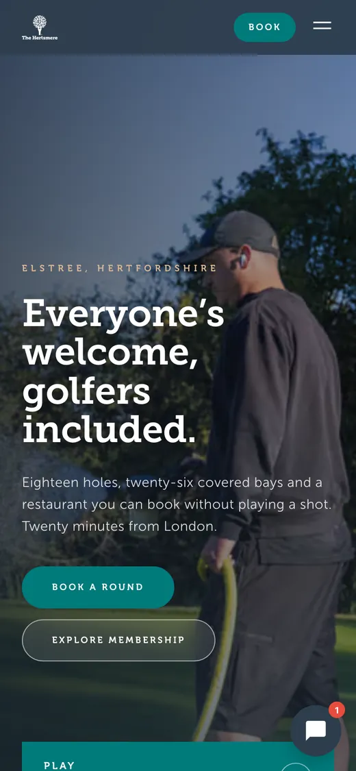
The new site self-hosts three font files. One is Museo Slab 700, declared for every weight from 100 to 700. One is Museo Sans 300, for 300 and 400. The third, declared as Museo Sans for every weight from 500 to 900, is a file whose internal name is Museo 700: the original Museo, a related face but not Museo Sans. So every bold label, eyebrow and button on the site is set in the wrong family, and Museo Slab 300 and 900 and Museo Sans 100 are never loaded. All three are commercial fonts. Self-hosting them on a website needs a webfont licence from exljbris, and neither source shows one. Do not substitute Roboto Slab for Museo Slab, though the site's own fallback stack names it. It is a different face, and a fallback should never become the brand.
The typographic gap, and this page as the argument
The Hertsmere does not have a gap in its type system. It has a complete one, a slab for headlines and a sans for reading, from the same designer, with the wordmark already in the slab. The gap is in the implementation: one slab weight doing the work of three, and a different family standing in for bold sans. Fix the files and the site will look the way the guide intended. This page is set in the club's own faces, from the font files the club supplied: Museo Slab 900 for display, Museo Slab 700 for headings, and Museo Sans 300 for reading. Museo Sans 700 is not among the files held, so bold text on this page falls back to Museo 700, the same substitution the new site makes. The webfont licence for showing these files outside the club's own site is decision 5.
AaDisplay, Museo Slab 900
AaEverything else, Museo Sans 300
Display · Museo Slab 900 · 56 to 72px
A fresh approach to golf
H1 · Museo Slab 700 · 40 to 48px
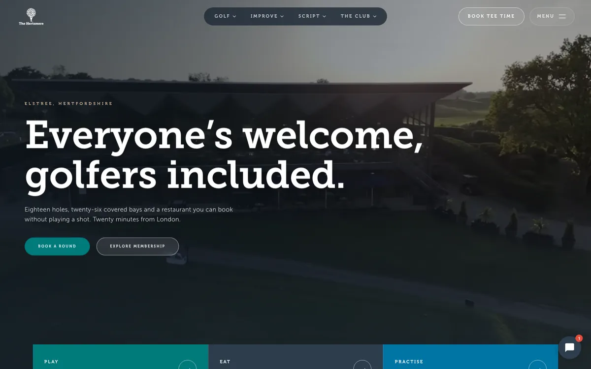
Everyone’s welcome, golfers included
Body · Museo Sans 300 · 17px · line-height 1.6
Eighteen holes, twenty-six covered bays and a restaurant you can book without playing a shot. Twenty minutes from London.
Label · Museo Sans 700, shown here in Museo 700 · 13px · letter-spacing 0.06em
Book a tee time
Hierarchy Proposed
| Level | Face | Weight | Size | Line height | Use |
|---|
| Display | Museo Slab | 900 | 56 to 72px | 1.1 | Hero, covers, signs |
| H1 | Museo Slab | 700 | 40 to 48px | 1.15 | Page titles |
| H2 | Museo Slab | 700 | 30 to 34px | 1.2 | Section headings |
| Standfirst | Museo Slab | 300 | 20 to 24px | 1.3 | The guide's own intro style |
| Body | Museo Sans | 300 | 17px | 1.6 | Paragraphs |
| Caption | Museo Sans | 300 | 14px | 1.4 | Photo captions |
| Label | Museo Sans | 700 | 13px | 1.2 | Buttons, eyebrows. Uppercase |
| Numerals | Museo Sans | 100 | 40px and up only | 1.1 | Large numerals; too thin below |
Typographic rules
- Line length 60 to 75 characters. Body copy sits in a column, not edge to edge.
- Sentence case for headings, as the new site sets them. The guide sets its own section titles in Title Case, a 2023 habit rather than a rule it states. Capitals only on small labels and buttons.
- Never centre a paragraph. The guide asks for ranged left with a balanced ragged edge (page 17).
- Never justify. It creates rivers at this line length.