The person we help
Club leaders and the teams responsible for membership, visitor bookings, events and the club's reputation. They need work that fits the club and a clear route from interest to enquiry.


Albatross / Brand guidelines
A shared identity for creative expertise
and a connected system.

Creates
demand.
Brand. Campaigns. Content.
Specialist expertise that makes a club worth choosing.

Captures
opportunity.
Websites, conversations and customer follow-up.
The connected tools behind the next step.
A guide to putting it together
Start with the idea. See how it looks and sounds. Then try the tools, explore the work and take the right files with you.
Go straight to the assets ↙Part 01
What we stand for, who we help, and how Albatross and Capture fit together.
01 / Foundation
Albatross reveals the value in a club and creates demand. Capture makes the opportunity easier to act on and easier to measure.
See the relationship ↓Our positioning
Club leaders and the teams responsible for membership, visitor bookings, events and the club's reputation. They need work that fits the club and a clear route from interest to enquiry.
The experience on the ground can be better than the story online. We help the club show its character, reach the right people and make the next step easier.
Specialist creative work and connected customer journeys. Show the work and explain the process. Support claims about commercial results with named, dated evidence.
Brand architecture
Lead with the club’s need, then show how the connected parts help.
Brand · Campaigns · Content · Strategy
Sites · CRM · Concierge · Email Studio
Capture Intelligence is a pilot. Introduce the suite as “Capture by Albatross” once, then use the product names directly.The public outcome
Help the right people find your club.
Give them a reason to choose it.
Make the next step easier to take.
One connected method
Make the club easier to find, understand and remember.
Turn interest into a useful enquiry or conversation.
Help the team follow up with context and care.
Keep relationships warm with relevant communication.
Part 02
A familiar signature. Expressive type. Colour with purpose. Real work, given room.
02 / Logos & naming
Use the original marks, then let typography, purposeful colour and real proof carry the personality. The system should feel clear before it feels decorative.
Original green artwork on white
Keep at least the height of the lowercase “t” clear on every side. The optional overlay illustrates the principle; measure from the master artwork in production.
Minimum width: 120px digital · 30mm print. For smaller placements, request an approved symbol asset rather than reducing the wordmark further.
Recoleta belongs to the wordmark only. Do not typeset a replacement, stretch it, add effects or put it over a busy image. Use the supplied light version on a dark field.
Download this logo · PNG ↓03 / Colour
Green establishes ownership. Ink gives authority. Pink and yellow interrupt at the moment they are needed. Select a swatch to copy its value.
Pink and yellow are punctuation. One decisive moment is stronger than repeated decoration.
Colour in use
A little colour.
A lot of character.
Try a pairing
WCAG AA text contrast: 4.5:1 for normal text; 3:1 for large text (24px, or about 18.7px bold). This checks text contrast only. Read the standard ↗
Colour in context
More demand.
A clear message deserves a readable setting.
Use Ink on White, Mist, Pink or Yellow for reading. Use Dark Green for small green text on light backgrounds. White on Albatross Green is for large type; it does not meet the normal-text threshold. Keep labels legible and never communicate status through colour alone.
04 / Typography
Bricolage Grotesque carries our editorial voice. Inter keeps explanations, controls and product language clear.
Try a headline of your own. Give it one thought, a deliberate line break and room to land.
Bricolage and Inter replace the Montserrat direction in v1.2, following the September 2026 typography decision.
Bricolage Grotesque / 750
Your club has more potential than its marketing reveals.
Working scale adapted from the v1.2 size hierarchy to the selected fonts. Test actual line breaks and responsive layouts.
05 / Photography & film
Choose light, texture, place and human detail. Use genuine clubs, real operating moments and crops that leave intentional room for the message.

One image. Different jobs.
Change the format, then move the focal point. Protect the subject and the recognisable detail; do not shrink the desktop crop into a mobile card.
Tehidy Park · actual club photography. This tool previews a crop; it does not alter the source file.
The club, in motion
Two Albatross films. Watch the pace, the light and the human detail as well as the course.
 Play St Ives ▶
St Ives Golf Club · club film
 Play Moor Park ▶
Moor Park · club film
Players load from Vimeo when you select a film. Direct Vimeo links remain available in the player.
06 / Motion & Capture
Discover. Capture. Convert. Cultivate. Use motion to explain one connected journey, then let it settle. Select a stage or replay the whole sequence.
Illustrative journey, not a live product interface or proof of an installed integration.
Select a stage to explore the journey.
Reveal: 200–350ms. Connect: 350–600ms. Resolve: 600–900ms. Complete the short sequence within four seconds, then pause. Respect reduced-motion preferences with immediate state changes. Use scroll-linked movement for an editorial story, as demonstrated in this guide. Keep reading sections stable and turn it off for reduced motion. Do not add continuous decorative loops.

Illustrative journey 01 / 04
A clear club story reaches the people it matters to.
Brand, campaigns and content
07 / Applications
 View the work ↗
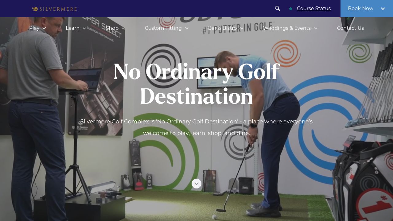
Silvermere’s large images and clear routes help visitors explore the venue. Present the real work at a useful scale.
 View the work ↗
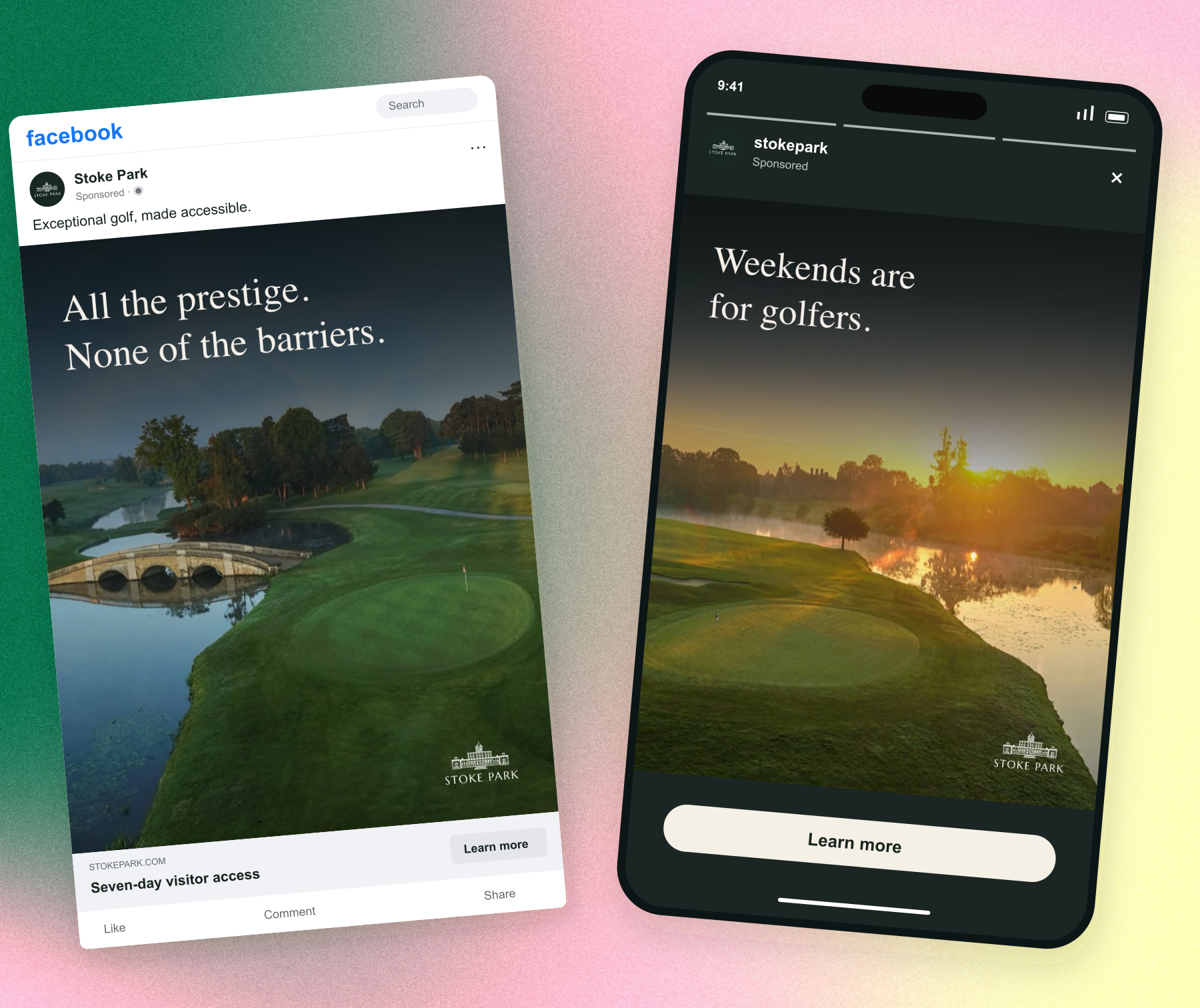
A single message and a distinctive piece of course photography hold the composition together across placements.
View the work ↗Natural light and recognisable course detail give the image character. Keep the greens believable and the crop intentional.
Part 03
The confidence of a specialist. The warmth of someone who understands a club. The clarity to say what happens next.
08 / Voice & messaging
Specific nouns. Active voice. British English. Start with the club’s need, explain what changes and bring the evidence with you.
Unlock next-level growth with our cutting-edge ecosystem.
Golf marketing for clubs with more opportunity than in-house resource.
Name the buyer and the problem. The positioning gives a club leader a reason to pay attention without an inflated promise.
We are delighted to introduce our revolutionary suite of solutions.
If enquiries are arriving but follow-up is inconsistent, let’s look at what happens after the first message.
Working example: begin with a recognisable situation. Invite a useful conversation instead of claiming to know the club’s results.
Let’s supercharge your club’s potential!
Connect the source, review the field mapping, then run the first sync.
The product voice is calm and instructional. Show the next step and the result of an action. Use actual product instructions only where that workflow is supported.
Every number needs an owner, source, period and comparison. A website screenshot proves a piece of design work; it does not prove a revenue increase. Use “Capture Intelligence is in pilot” until release status is verified.
Writing style
Keep the personality in the thought. Let the reader get to the point.
Lead with an outcome or a recognisable need. Use the sentence underneath to explain how. Product names belong in the label and navigation, not in every line.
Members, visitors, enquiries, bookings and the team. Prefer “help people find your club” to “optimise audience acquisition”. Be precise about who does what.
Use British English and sentence case. Keep paragraphs short enough to read on a phone. Write buttons as actions: “Explore Sites”, “Discuss your brand”, “Request a visit”.
Separate a live capability from a pilot or a concept. Explain setup requirements when they change what a buyer can do. Give results their source, period and context.
Message hierarchy
Assets / Downloads
Original supplied logo files, selected fonts and the grain asset used in this guide. Keep the font licences with the files.
Foundation, logo rules, palette and production principles follow the Albatross and Capture Brand Guidelines Text v1.2, issued 6 September 2026. The later Bricolage/Inter decision replaces Montserrat. The 8 September website audit governs product and evidence boundaries. The earlier cut-corner pattern is optional, rather than a required device. The three-part structure and scroll presentation are adapted from the St Ives club-brand-book skill; Klarna informs the routes into practical brand guidance.
Client work is credited beside each example. Illustrative interfaces, crops and motion explain the system; they do not establish product availability, client approval or measured results. Verify release status and permissions before publishing an application.
Production checks